

Yoga Responsive Website
Project Overview
Yoga is a local yoga studio whose mission is to make yoga accessible to everyone while also supporting causes that promote sustainability.
Kickoff
Client - Project for Practice (No Client)
My Role - UX/UI Designer
Timeline - 5 Weeks , October 2022
Tools - Adobe XD, Photoshop, Principle, Paper-Pen-Pencil
Responsibilities - Conducting interviews, paper and digital wireframing, low and high-fidelity prototyping, conducting usability studies, accounting for accessibility, iterating on designs, determining information architecture, and responsive design
Problem
Problem: The yoga website has an uninteresting user interface and important information - such as its mission, charitable causes, instructor information, and class offerings - is hidden or poorly displayed.
-
The users are facing problems picking the most suitable class based on their level of expertise since they find the current filtering UI too confusing - and none of the listing cards mention these levels.
-
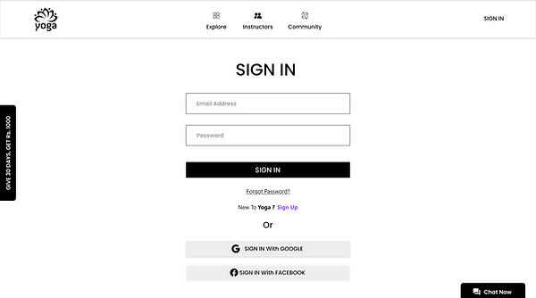
Customers have also complained about the user journey being too confusing for them when they need to Sign up/ sign in to the business’ web store, select an appropriate service, book a time slot based on availability and make a payment after reviewing their booking at the checkout page.
-
Customers have also mentioned that there was a lack of information regarding the Instructors who were going to handle the class or take appointments - for them to be able to book the right class based on the instructor’s knowledge and expertise.
Solution
Solution: To better reflect Yoga's mission and increase user trust and engagement, our redesign focuses on improving site navigation and creating a cleaner, calmer UI.
Understanding the user
●
User research
● User research
● Personas
● User journey maps
● Ideation

I conducted user interviews to gain a better understanding of the target user and their needs, which I then translated into empathy maps. When they need to own products from users they like, I discovered that many of my target audience wants to make them available in all digital protucts while also supporting causes that promote sustainability. Many Yoga class websites are overwhelming and difficult to navigate, much to the chagrin of many target users. This made an activity that would normally be enjoyable for them difficult, negating the goal of relaxation.
●
User research: Pain Points
- excessively long pages with large text blocks and poor information architecture.
- no CTA, value proposition, or captivating hero image on homepage.
- no differentiation between which elements are clickable and which are not.
- distracting and chaotic UI style with jarring colours and bold, italicised text.
●
Personas

●
User journey maps

●
Ideation
I did a quick ideation exercise to come up with ideas for how to address gaps identified in the competitive audit.
I like
I Wish
What If

Starting the design

●
Digital wireframes
● Digital wireframes
● Low-fidelity prototype
● Usability studies
Moving from paper to digital wireframes made it easy to understand how the redesign could help address user pain points and improve the user experience. Prioritizing useful button locations and visual element placement on the home page was a key part of my strategy.


●
Low-fidelity prototype
linked all of the screens involved in the main user flow and produce a low-fidelity prototype. At this stage, design members had given me input on my designs about elements like button placement and page arrangement. I paid close attention to their comments, and I put a number of their suggestions into action where they addressed user annoyances.
Usability study
Study Type - Unmoderated usability study
Location - India, remote
Participants - 7 participants
Length - 30-60 minutes

1
2
3
Booking Process
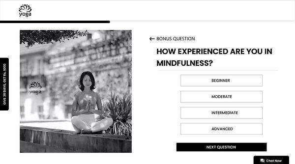
Picking the most suitable class based on their level of expertise
Resources
Users are requested to provide valuable information on the start, so to find what they are looking easier.
Notification and Confirmation.
Detaiil booking confirmationa and updates are listed in the notification selction.
Refining the design
● Mockups
● High-fidelity prototype
● Accessibility

●
Mockups


●
High-fidelity prototype

●
Accessibility
01
Providing an AI Assistant for interactive user query and help.
02
The initial focus of the home screen on personalized recommendations help define the primary task or action for the user.
03
I used headings with different sized text for clear visual hierarchy
Onboarding Screen
UI Style Guide

1
Conduct follow-up usability testing on the new website
2
Identify any additional areas of need and ideate on new features
Next Steps
3
Iteration of High – Fidelity from the research.
Takeaways
- Remind yourself that the amount of text a user is willing to read is almost always less than what we (as designers) believe.
- Excessive emphasis on creating a "vibe" on a website can lead to a loss of focus on the product and the user.